Backlit Signage Artwork: What Works Best? (Lightbox Graphics That Actually Glow)
Backlit signage can look premium or painfully amateur depending on the backlit signage artwork. Your backlit sign design needs to be built specifically for illuminated printing. This guide tells you exactly how to achieve that!
4/2/20264 min read
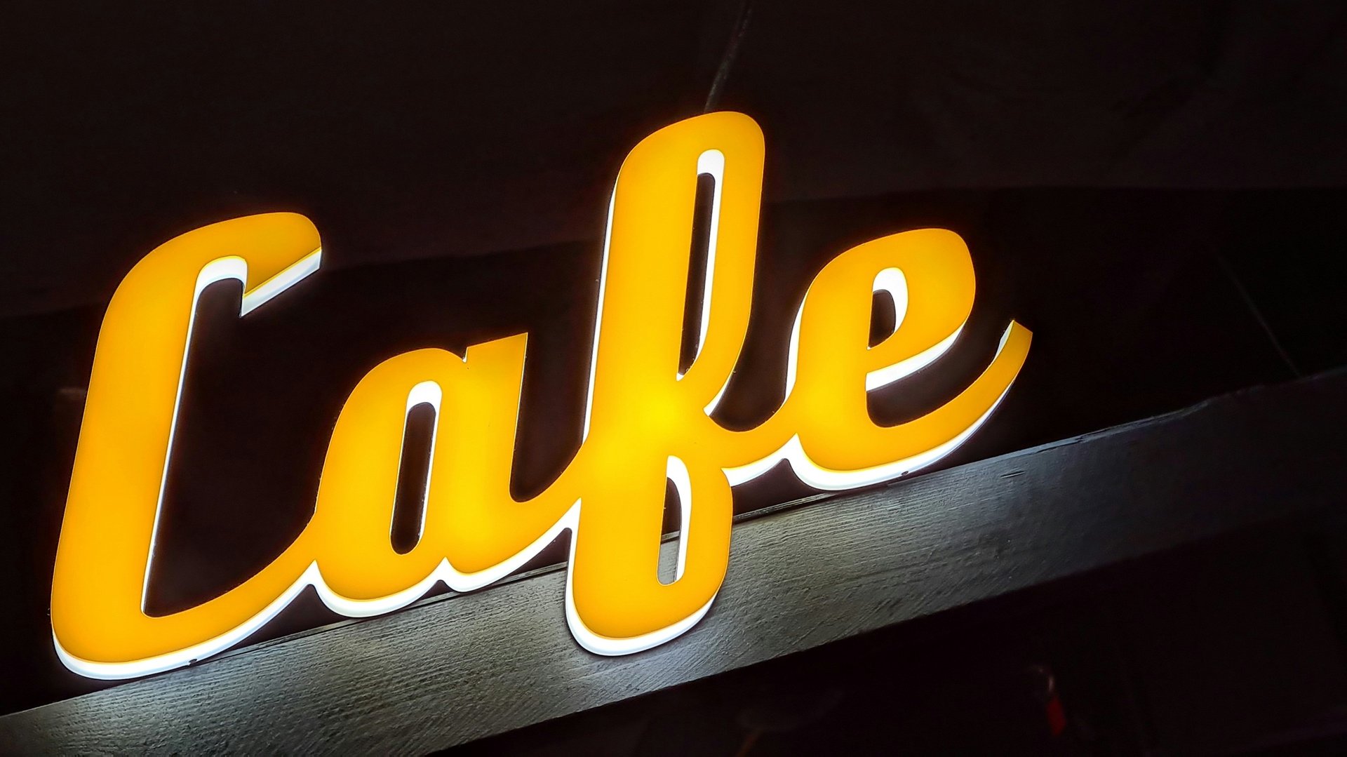
Backlit signage can look premium or painfully amateur depending on the backlit signage artwork. People also call these lightbox signage or backlit lightbox displays. Your backlit sign design needs to be built specifically for illuminated printing if you want crisp backlit graphics. Regular posters won't give you evenly lit results with rich color. Build your files the right way to avoid ugly surprises.
How to Set Your Backlit Signage Artwork for The Best Results
Here is all you need to know to create a file that produces the best quality results for your signage.
1) Start with the right goal: readability + glow
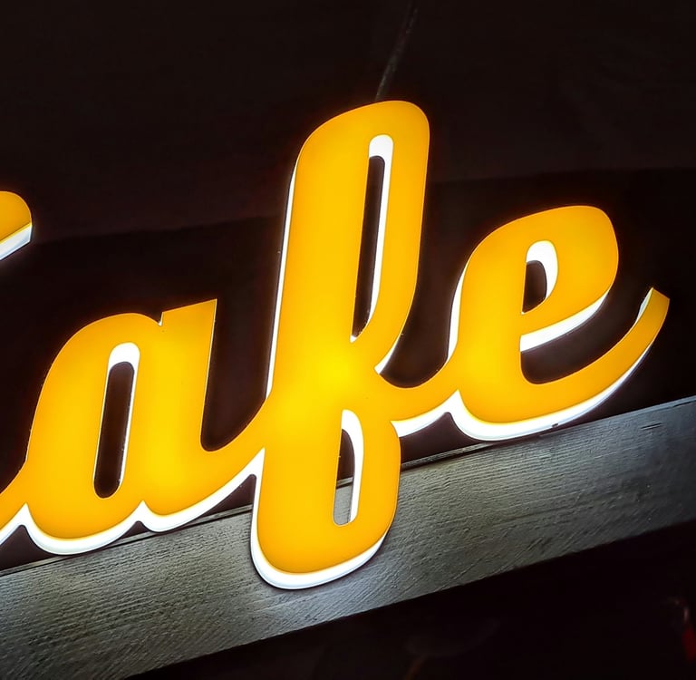
Create simple, high-contrast designs for the ideal backlit sign design. Make sure people can read it easily from a distance. The light behind the print can quickly wash out detailed info or low-contrast colors. This happens often with an LED lightbox.
Best Practice: Bold shapes, simple typography, and a color scheme should be the building blocks of great backlit signage artwork.
2) Best colors for backlit signs (and what to avoid)
When a sign is illuminated, lighter colors can become overly bright, and dark colors can open up and look “thin.” That’s why best colors for backlit signs usually follow these rules:
Make sure there is high contrast between the background and text—think ‘readable at a glance.'
Avoid large areas of near-white if you don’t want a very high-intensity glow.
Be careful with very subtle pastels and low-contrast gradients—they can ‘disappear’ when lit.
If you are designing for a menu board backlit design or a retail lightbox poster design, make sure ‘legibility’ comes first and ‘aesthetics’ second—because ‘engagement’ drops off very quickly if it’s not ‘readable at a glance.'
3) RGB or CMYK? (Backlit signage color mode)
People often ask if they should use backlit signage color mode RGB or CMYK. Always prepare your final file in CMYK for print production. This ensures your sign prints correctly.
Tip: You can design in RGB for your screen, but always convert it for final output. Proof your key colors before you start the backlit signage printing.
4) Rich black, black density, and deep contrast
Backlit prints can make blacks look weak if they’re not built correctly. This is where backlit signage black density/rich black matters.
Use a print-appropriate rich black mix (not just 100% K) for large black areas.
Avoid overly heavy total ink coverage that can cause issues in production.
Use true black strategically—too much can reduce the “glow” effect.
This is one of the biggest differences between average artwork for backlit signs and backlit graphics that look premium when lit.
5) Gradients and banding: keep your glow smooth
Designers love gradients, but gradients for backlit printing need extra care because illumination can reveal imperfections.
To avoid banding in backlit prints:
Use smooth gradient builds (not harsh transitions).
Add subtle noise or dither if you need to break up visible steps. Avoid compressing the final artwork. Export your files with quality settings suitable for print.
If you’ve ever wondered how to prevent hotspots in lightbox graphics, clean gradient handling is part of the answer—because banding and uneven glow get amplified the moment the LEDs turn on.
6) Resolution: the DPI that prevents fuzzy lightbox graphics
Backlit signage resolution (DPI) depends on final size and viewing distance, but the principle is simple: don’t scale up low-res images and expect them to look sharp when backlit.
For most lightbox signage designs, use high-quality source images and build artwork to final size whenever possible. Backlighting makes softness and artifacts more noticeable.
7) Bleed and safe area (so nothing gets cut off)
Professional backlit sign file requirements include proper trimming allowances.
Backlit sign bleed and a safe area are essential for clean edges and readable text.
Keep critical text/logos inside the safe area.
Extend background artwork into the bleed so you don’t get white edges after trimming.
This applies to everything from backlit film graphics design to SEG lightbox graphics design.
8) Material matters: backlit film vs fabric (SEG)
Your artwork approach should match the material:
Backlit film graphics design Film can deliver sharp detail and strong color, but it also makes uneven lighting more obvious. Strong contrast and clean gradients matter a lot.
Backlit fabric lightbox graphics / SEG lightbox graphics design Fabric looks premium and diffuses light nicely. However, ultra-fine details may not look as crisp as they do on film. Keep your typography bold. Avoid using overly thin lines.
If you offer multiple substrates, call this out clearly on your service pages for backlit signage printing, custom backlit signs, and even searches like lightbox printing near me.
9) Quick checklist: artwork that works best for backlit signs
Use this before sending files to print:
High contrast + bold typography (readable fast)
Print-ready color handling (CMYK workflow)
Correct rich black choices for deep areas
Smooth gradients to avoid banding
High-quality images and correct DPI
Correct bleed and safe area
Design choices suited to backlit film or backlit fabric lightbox graphics (SEG lightbox graphics design)
Conclusion: Make Your Lightbox Look Premium
Great backlit signage artwork isn’t just “nice design”—it’s design that anticipates illumination, materials, and production so your backlit sign design looks clean, bright, and consistent in real life. If you want help preparing print-ready backlit sign file requirements (or you want us to print your next backlit graphics project), check out Stampare Productions and request a quote—let’s make your next backlit lightbox impossible to ignore.
Frequently Asked Questions
1. Why does backlit signage artwork appear so vibrant and “glowy” inside a light box?
Apply higher contrast visuals, increased saturation, and graphic designs that consider the passage of light through the artwork.
2. Is backlit signage artwork intended to be brighter than regular prints?
Yes—backlit prints often need a controlled brightness lift so they don’t look dull once illuminated.
3. What file specs work best for backlit signage artwork?
Provide print-ready files at the final size. You can also use a scaled size. Use high-resolution images. Apply the CMYK profiles your printer recommends.
4. How can I avoid hot spots or non-uniform glow in my backlit signage art?
Stay away from large and plain mid-tones and use gradients. Good lighting and use of correct diffusing materials are equally important.
5. What color scheme and font style are best for reading from illuminated sign boards?
Use color schemes that have high color contrast (such as white lettering against a black background or vice versa) while using bold fonts.
Contact
Reach out for custom UV printing quotes
Phone
asif_lone@hotmail.com
+92 3335 5344 43
© 2025. All rights reserved.
Trust & Process: How It’s Made—From Order to Pickup