
7 Reasons Your UV Print Looks Dull (White Ink Fix Guide)
“My UV print looks dull” is the most common complaint we hear in the UV printing business. This guide shows you the 7 reasons your UV printing on dark material looks washed out and how white ink fixes dull UV prints.
7/27/20268 min read
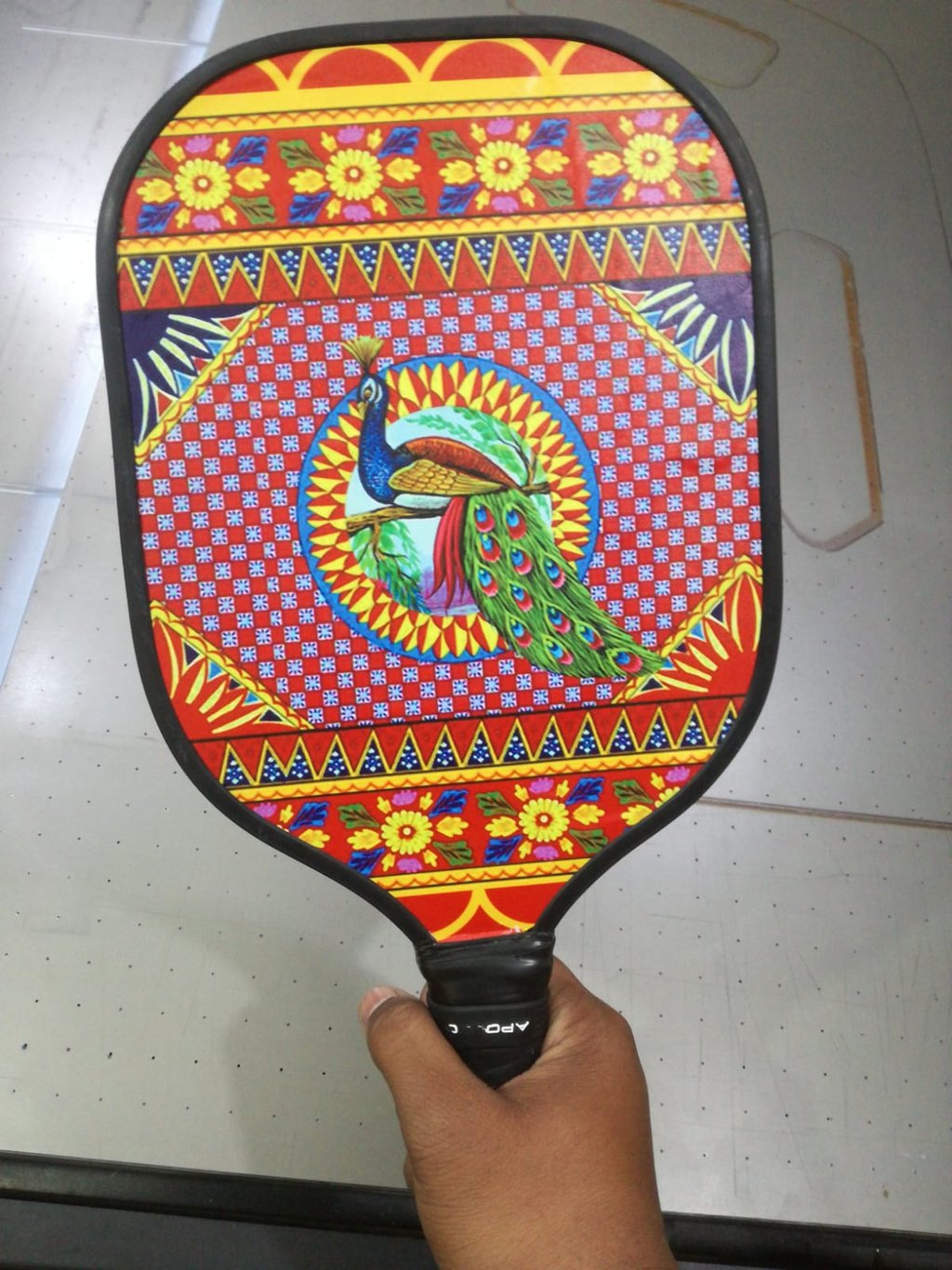
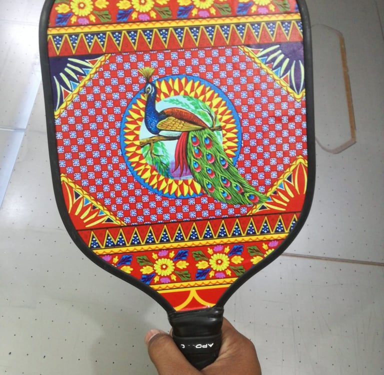
“My UV print looks dull” is the most common complaint we hear in the UV printing business. A designer prints a vibrant red logo on black acrylic, and the red looks brown. UV printing on acrylic looks dull, and the UV print looks gray instead of rich. UV printing colors look faded on wood, and the wood print looks muddy on walnut. The designer Googles why the UV print looks dull and why UV printing gives dull colors on dark materials.
The reason is simple. UV ink is translucent. Without white ink printing in Karachi as a base, the color has no reflection. UV print looking transparent on black is not a printer defect; it is physics. White ink UV printing with a proper white underbase with UV ink fixes 90% of dull prints. White ink on black acrylic is not optional. It is mandatory on dark materials for opacity. UV printing opacity depends on white ink opacity.
This guide shows you the 7 reasons your UV printing on dark material looks washed out and how white ink fixes dull UV prints.
For the full technology comparison and cost breakdown, read our pillar UV Printing vs Eco-Solvent vs Latex in Karachi (2026): The Complete File, Material, and Cost Guide.
7 Reasons Your UV Print Looks Dull and How White Ink Fixes It
Let's explore why your UV print looks dull and how a white underbase can fix it.
Reason 1: No White Underbase on Dark Material
No white underbase is the number one reason UV print looks dull on dark materials. White ink on black acrylic is missing, so the colors go transparent. UV printing on acrylic looks dull because the light is absorbed by the black instead of reflecting through the color. UV print looking dull on black acrylic is 100% caused by having no white underbase.
A white underbase in UV printing is a layer of white ink that’s printed first, and then the color is added on top. White ink printing in Karachi on dark materials needs flood white. UV printing on dark materials without white is like painting with watercolors on black paper.
The UV print being transparent on black makes blue look navy and red look brown. White ink UV printing blocks the dark background and makes the UV printing colors that were faded become vibrant. White ink adds Rs 80 per sq ft extra but is mandatory on dark materials. Without it, you have to pay for a reprint. White ink fixes the dull print instantly.
Reason 2: Single Layer White is 60% Opacity
A single layer of white gives only 60% opacity with white ink. Many shops print one pass of white and call it a day. 60% opacity of white ink still lets the black show through, so the UV print looks dull and the UV print looks gray. White ink opacity needs double strike white ink printing for 95% opacity of white ink.
Single layer white opacity means you see a ghost of the black through the white. White ink on black acrylic with a single layer looks light gray, not white. The color on top still looks washed out. 95% opacity of white ink needs double strike printing, where the white is printed twice. The double strike white ink fix prints with white ink, cures it, prints the white again, and then adds the color.
A white underbase of UV ink with double strike white ink is standard for UV printing on black acrylic. White ink printing in Karachi that charges Rs 30 for white uses a single layer. We charge Rs 80 per sq ft because we use double strike for white ink opacity that actually works. White ink fixes dull UV prints only when the opacity is 95%, not 60%.
If you are deciding whether double strike is worth paying for, read 5 Times White Ink and Layered UV is Worth Paying For (And 3 Times It’s Not) where we show the ROI for black acrylic signage.
Reason 3: Printing Color Direct on Aluminum
UV printing on aluminum looks dull when you print the color directly on aluminum. Printing color directly on aluminum without a white base makes the reflection kill the saturation. Aluminum is mirror-like. Aluminum print looks washed out because the silver reflection mixes with the color and desaturates it.
UV printing on an aluminum composite needs white ink UV printing even though aluminum is light. Aluminum composite printing looks dull because bare aluminum reflects 80% light through the translucent UV ink. The reflection kills the saturation, making red look pink and blue look light blue. UV printing on aluminum looking dull is not an ink issue; it is a reflection issue.
Here’s how to make aluminum print look vibrant. Use a white underbase of UV ink, then add the color along with a clearcoat. The white ink blocks the reflection, making the color pop, and the clearcoat adds gloss. Fixing an aluminum composite printing that looks dull costs Rs 80 per sq ft extra for the white ink, but it saves you from reprinting.
For full aluminum prep, including degreasing and primer that also affects dullness, see 6 Material Prep Rules Before UV Printing on Acrylic, Aluminum, and Wood.
Reason 4: Wood Grain Absorbs Ink
UV printing on wood looks dull because the wood grain absorbs ink. Wood prints look muddy, and UV printing on wood looks faded when there’s no sealer. The wood’s grain absorbs the ink into the pores. This makes the ink spread, and the ink sinks into the wood, making the wood print look muddy.
UV printing on wood looks dull when you use walnut wood and oak because the dark grain tints the color. MDF printing looks dull because MDF is a sponge. The ink sinks into the wood, causing the UV printing colors to look faded and the text to look fuzzy. A wood sealer for UV printing is mandatory for UV printing on wood. The wood sealer blocks the absorption.
Here’s how to make a wood print look vibrant. Sand the wood at 220 grit, apply acrylic sealer, and light-sand. Then use white ink printing in Karachi at half-tone white with 50% opacity if you want the grain to show or 95% white if you want flat color. The wood grain absorbing ink is prevented by the sealer that blocks absorption and keeps the ink on the surface.
Reason 5: No Clearcoat
Sometimes the UV print looks matte, but the client expects gloss. Having no clearcoat while UV printing causes the UV printing’s finish to look dull. The UV print looks matte vs. the expected gloss because bare UV ink is satin, not high gloss. No clearcoat in UV printing makes the UV printing colors look faded and less vibrant. This is because the matte finish scatters the light.
A UV printing clearcoat adds gloss and depth. Clearcoat UV printing in Karachi adds a clear gloss layer on top of the color. Matte vs gloss UV printing – matte looks 15% duller than gloss to the human eye. Why is the UV print not glossy? Because there’s no clearcoat after UV printing. Gloss coating the UV print increases perceived saturation by 20%.
If the UV print looks matte, you can fix it by adding a UV printing clearcoat layer named Spot_Gloss. Clearcoat UV printing in Karachi costs Rs 60 per sq ft, but it makes the color pop. Matte vs gloss UV printing is a choice, but the client must be told. The UV printing finish looking dull is an expectation mismatch.
For durability levels of clearcoat from retail to outdoor, read 5 Levels of Scratch Resistance for UV Prints, where we explain hard coat vs. gloss coat.
Reason 6: Wrong ICC for Acrylic
A UV printing ICC profile mismatch is reason six for dull prints. Having no UV ICC profile and using a paper profile on acrylic causes brand colors to look off after UV printing. Using the wrong profile for RGB to CMYK conversion in UV printing creates a UV printing color shift, and the brand colors look off after UV printing.
A UV printing ICC profile for acrylic is different from paper. Paper absorbs ink; acrylic does not. Using paper profiles on acrylic makes the UV printing colors look faded because it reduces the ink limit for absorption that does not happen.
So, why do the colors look wrong on acrylic? RGB to CMYK UV printing with sRGB to GRACoL makes red look orange. UV printing color matching needs a custom ICC. A UV printing ICC profile for acrylic increases saturation by 15% over a paper profile.
Reason 7: Low Resolution File
Low resolution UV printing causes dullness through blur. UV printing resolution matters because UV printers are sharp. You might wonder, “Why does my UV print look blurry?” The answer might be that your file is 72 DPI from the web. The UV shows every pixel, and the blur looks dull. Low resolution UV printing at 72 DPI from the web looks pixelated and faded.
What resolution is best for UV printing? 300 DPI is best for UV printing of small items under 2 feet; 150 DPI is best for UV printing of large signage over 4 feet. UV printing looks pixelated at a low resolution. This makes the print dull because the edge pixels interpolate gray. A UV printing resolution below 100 DPI makes the UV printing colors look faded because the pixels are stretched.
The file setup for UV printing needs a vector file for logos. UV printing shows every pixel so a low resolution is obvious on smooth acrylic. 300 DPI in UV printing vs 150 DPI in UV printing – small text needs 300; a large background can be 150.
Conclusion: Learn Why Your UV Print Looks Dull
UV print looks dull on acrylic, aluminum, and wood because there is almost always no white underbase. White ink printing in Karachi for UV printing on dark materials is Rs 80 per sq ft extra, but it’s mandatory on dark backgrounds.
Stampare Productions is Karachi’s in-house UV specialist for white ink UV printing and fixing UV prints that look dull. Our in-house UV process measures white ink opacity with a light table, and we use double strike white ink for 95% opacity. We do a UV printing ICC profile calibration for acrylic and wood, and we check the UV printing resolution for free. That is why designers and personalized gift stores trust us for the best UV printing in Karachi that is vibrant, not dull.
Send us your dull print's photo and material. We will tell you which of the 7 reasons caused it and send you a 10x10cm double strike white ink fix sample with white ink on black acrylic using double strike white ink. Reach out to Stampare Productions today for white ink printing in Karachi that makes UV printing colors become vibrant.
For the full material prep that prevents dullness from peeling and sinking, read our pillar UV Printing vs Eco-Solvent vs Latex in Karachi (2026): The Complete File, Material, and Cost Guide.
Frequently Asked Questions: Why UV Print Looks Dull
1. Why does my UV print look transparent on black acrylic?
UV print looks transparent on black materials because there’s no white underbase. UV ink is translucent so the black shows through. White ink on black acrylic with a white underbase blocks the black.
2. What is double strike white ink, and why does a single layer have 60% opacity?
Single layer white opacity is only 60% opacity of white ink. This makes the light leak through, and the color still looks dull. Double strike white ink prints white twice for 95% opacity of white ink.
3. Why does UV printing on aluminum look washed out?
UV printing on aluminum looks dull because printing the color directly on aluminum causes the reflection to kill the saturation. White ink UV printing with a white underbase blocks the reflection. UV printing on an aluminum composite needs white ink plus a clearcoat for a vibrant result.
4. Why does my wood print look muddy?
A wood print looks muddy because the wood grain absorbs ink and the ink sinks into the wood. UV printing on wood looks dull when the vendor uses no sealer. A wood sealer for UV printing seals the pores and stops the absorption.
5. Does a clearcoat make UV prints less dull?
Yes. A UV print looks matte without a clearcoat and looks 15% duller than gloss. No clearcoat in UV printing causes the UV printing’s finish to look dull. A UV printing clearcoat adds a gloss layer that increases perceived saturation 20%.
6. What resolution do I need for UV printing on acrylic so it does not look dull?
Low resolution for UV printing looks dull because the blur looks faded. The best resolution is 300 DPI for UV printing on items under 2 feet and 150 DPI for UV printing on large signage.
Contact
Reach out for custom UV printing quotes
Phone
asif_lone@hotmail.com
+92 3335 5344 43
© 2025. All rights reserved.
Trust & Process: How It’s Made—From Order to Pickup